Wednesday, October 29, 2014

Quilt Market - Eclectic Elements

Hello everyone! Glad to be back home again after spending the 5 days at quilt market (trade show) in Houston, TX.  Tim will be reviewing our booth on his blog, so I thought I would concentrate on what I saw at the show. 
We walked to the hall where we started began unpacking two large crates.  It was super cold in the hall (the polar opposite to the last show) so we just kept moving fast, to stay warm.  In the down time, some people may have been using the large shipping crates as a house.  Always a good time working with these two.
We participated in Schoolhouse, which is where the designer presents his or her new collection to a group of attendees.  We quickly set up a display of items from the booth.
Tim gave a short presentation about the Eclectic Elements Brand and afterward people could come up and see the samples and ask questions. We also had a giveaway, which ALWAYS makes people happy!
After Schoolhouse was over, we were back down on the trade show floor to place samples and finish the details of our booth. 
Some of us were sporting the free giveaway glasses from Schoolhouse, but I won't name any names.
And finally we were done for the day.


I thought I could share with you a tiny portion of the Show Floor and some of the surrounding booths.  Amy Butler was directly behind our booth...wow, the color and pattern was amazing.

 Amy Butler

 Heather Bailey

 Anna Maria Horner
Loved this prize ribbon quilt in the Anna Maria Horner booth.
Felt, felt, felt...swoon
The next three photos are from Art Gallery Fabrics.  Always great displays!


Cotton+Steel
 Bespoke
 Birch Fabrics - Always fresh and vibrant!
I did not write down the name of this booth but I believe these are Kokka fabrics, a company from Japan that produces organic fabric.  Their prints were modern with super fun images.
Alexander Henry

The Quilt Hall
Next to the trade show there is a huge (and I mean really huge) hall where the quilts are hung for viewing.  Richele and I walked around the hall for about 1 1/2 hours trying to take in as much as we could in the time we had.  The centerpiece of the room was a display of red and white (or cream) quilts that had to have been 24 tall.  It was amazing to stand under it, which you needed to do since the quilts were hanging back to back.  It was absolutely breathtaking.
You can only photograph a portion of the quilts in the main hall, so I picked a few from the 100's and 100's of quilts to show you here.  I photographed the information that was given about each quilt and have reproduced the words here.  The information, history and thought process is my favorite part of the quilt hall.  One could literally spends hours upon hours looking and reading.  I think I might have needed to rent one of those motorized wheelchairs so I could just move along slowly and read as I went.  Richele and I decided we would probably just end up running into each other or knock over a wall of quilts.  
I know the photos will never do the quilts justice, so forgive the photography and enjoy...
Le Chapman
by Marie-Francoise Gregoire
France
"I saw this unfinished quilt, dated 1829, by Elizabeth Chapman in the Victoria and Albert Museum in London.  The paper templates for the English method of piecing were still there.  I realised this work by hand using a multitude of different fabrics, many of which were reproductions."
 Log Cabin Chevrone
by Marie-Josephe Veteau
France

"This is the most American of blocks, whose popularity has not declined in the last 150 years.  But, in Scotland and Ireland, the block was used in 1820.  By playing with the construction of the blocks, one realises effects of shade, perspective, ans geometric figures."

 Hexagones, Hexagones
Quand tu Nous Tiens!
by Cecile Lacoste
France 
"Inspired by an American quilt made by Maria Hester in 1830, this pattern of hexagons is also known as a Honeycomb Mosaic.  The pattern for it was published in the American Girl's book.  The hexagon was the first pattern printed int he USA.  The first recorded work using the hexagon in America is 1817.  In England the use of hexagons date back to 1801.  The was a strong tendency in America to follow the English fashion.  Maria died in 1831 and the quilt was never finished.  Cecile, touched by this story, was inspired to make this magnificent interpretation of the quilt."


I wanted to show you this modern quilt because it was made by Amy Friend who creates samples for our booth.  I have never know someone who has had a quilt placed in this show so it was a nice surprise to see her name.  Congratulations Amy!
Melon Ice
by Amy Friend
"This quilt is foundation pieces with solids and supersized blocks to create a bold geometric design with clean lines.  Depending on how you look at this quilt, secondary patterns emerge.  The quilting is done in concentric circles, beginning at the lower right of the quilt's center to soften the geometric look."

Chasing Bubbles
Hiroko Miyama and Masanobu Miyama
Japan
"I find that soap bubbles are so colorful...they are a rainbow color, not white or transparent.  The dark colored watermill behind the bubbles was designed to make the bubbles more beautiful.  It was quite challenging to stitch the watermill.  The girls, dogs, and bubbles were all appliqued by using my original precision applique technique."

Snow Flowers
by Susan Stewart
Kansas, USA
"I resumed work on the quilt too soon after a tragic event.  When nearly finished, I discovered that I had made a mistake involving scissors.  It spent several months in a trash bag in a corner, and I spent several more months fixing the mistake, but I am pleased with the results"

Road to Roseland
by Megumi Mizuno
Japan
"There lives a princess in everyone's heart.  The light the princess emits connects people together, making them one.  To awaken the sleeping princess locked up in the castle of thorns, four princes set out on a journey." 

On this Winter Day
by Nancy Prince and Linda French
Florida, USA
"This quilt allows me the opportunity to step back in time to another, and perhaps simpler, way of life.  Approximately 75,000 yards of thread and seven million stitches created the thread-painted designs.  All lifelike designs were done in free-motion.  The quilt was completed of a seven-year period and took approximately 2,000hours to complete."
For anyone in the Houston area, the "to the trade" portion in now closed and The International Quilt Festival, which is open to the public, begins tonight, Oct 29 and runs trough November 2nd.  The "trade" hall where we were set up, is now being changed over to retail space where attendees can purchase patterns, fabrics and vintage items.  You can also take classes related to the industry.  So if you are interested in seeing the huge quilt hall or attending festival, now is the time to do it.  If not, then mark Oct 29-Nov 1st 2015 on your calendar to see what next year will bring!

If you do make your way to Houston this weekend (or any weekend) - stop in at "The Cafe" at the Hilton Americas next door to the convention center for this dessert - Tres Leches.  Seriously one of the best desserts I have ever had.  The moist round cake is sitting in a pool of creme anglaise (thin custard).  Praying it stays on the menu till October 2015 when we will be back again.

Giveaway
the giveaway is closed
If you are interested in using the Frameworks Courtyard die to re-create this little purse made by Richele, I have the kit to do it!  In fact, I have three!
The kit comes with the Frameworks Courtyard die, Phoomph and 2 pieces of fabric.  Richele also wrote a blog post showing how she did it.  You can check that out here
If you are interested in winning one of the three kits, please leave a comment on this post by Oct 31st.  I will pick three winners on Saturday, Nov 1st.  Good luck everyone!

now carry on,
paula

Thursday, October 23, 2014

Tim Holtz Media Team - Trick or Treat

HI everyone!  I am here today with my tutorial for the Tim Holtz Media Team.
You knew Halloween could not pass by without using THIS group of kids in a Halloween project, right?
It is no secret that I LOVE using Found Relatives!  I find them easy to work with (nice heavy paper) and even easier to make up a story about.
 

Today is no exception.
I hope you will follow along as I show you how to combine something new (Tim Holtz product) with something old (ephemera) to create a project for Halloween.

I started with the Found Relative card of course, since that gives me a direction (or story) for the entire project.  I cut out the kids using small fussy cut scissors.  No matter how careful you are, there are always places that will show the cut edge.  I have found that Pumice Stone Distress Ink will NOT “color” the photo, but it will hide the white edge (works really great around the faces).  I can always go back in with a brown Distress Ink later if I want to age the photo.

The House
I wanted to create a little “house” for the Found Relatives.  I thought about what I could use: Altoids Tin (too small), make a box from scratch (doable, but not enough time today), a very small gift box (didn’t have one).  So I sat for a minute and thought.  Then I glanced into a small bin of new Christmas stuff and there was the answer.  The Found Relatives box itself.  
I taped the box together, then cut off the "hanger" leaving the rectangle box.
 
I pierced the center of the box and cut out the entire top. 
I added Tissue Tape - Laboratorie to the sides of the box (inside and outside).
For the background, I created a monoprint on a #8 manila tag using the Shatter Layering Stencil and Crushed Olive, Dusty Concord and Ripe Persimmon Distress Ink (the perfect Halloween combination).  I was apprehensive about using Shatter, as I thought the lines of this Layering Stencil would be too thin.  But really, it could not have come out any better.
Once it was dry, I added a little Vintage Photo over the top of the tag to age it just a bit.
If you need a refresher on Monoprinting- see this post.

Trim the top and bottom to fit into the box, just make sure the spiderweb is in the left corner.
Once the tag was the right size to fit the small box, I used the children as a guide to gauge the placement of the spider stamp (love that spider!) which I stamped with Archival Ink.
Now just glue the tag into the box.
I wanted to add something dimensional to the bottom to "ground" the children so they don’t look like they are floating in the house (although, that might had been another interesting Halloween idea...floating children!)
I added some Multi Medium to the lower half of the box.
Then added the last of the Distress Stain dyed cheescloth.  I love the texture of the raw edges that hang over the edge.
You can use Distress Markers to “color” the Found Relatives.  Here I used Wild Honey to color the dress.  This may seem like I’ve lost my mind - Wild Honey looks like School Bus Yellow!  But the cards have a slick surface which works as a resist to the Distress Ink.  I find that by starting strong....
Then using a very small piece of paper towel or even lightweight fabric (my friend mr. cheesecloth works beautifully) you can work the ink around.  What I never use is my fingertip...way to easy to leave a fingerprint right in the middle of your ink work and surprisingly hard to control because it does not soak up the ink, it just moves it around.  In the end, the color should be very subtle.  Let it dry and then go over it again later to add another layer of color.
Next, I die cut a piece of Grungeboard using the Pediments die.  I couldn’t decide which of the 3 Pediment shapes to use, so I cut a couple then painted them with Black Soot Distress Ink.
Sand away some of the Distress Paint, then ink the Pediment with Vintage Photo.  I usually do this step multiple times...sanding, inking, sanding, inking, to get a really good aged effect.
I used another stamp from the same set as the spider that looks like a old pharmacy sign.  I colored it with Distress ink and used black embossing powder on the edges.
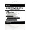
I used MM to add the Pediment to the top of the box.  Then added the Pharmacy sign with foam tape.
I needed a surface for the house of children.  I could have used a Burlap Panel but I wanted something larger so I could add words from the Paper Stash.   I used one of my favorite wood panels from Michaels - You might remember it from these two past projects - Big Top and Found.
The paper in from the stash is 8 x 8" but the board is about 9 x 7", so I cut off the excess paper at the bottom as well as the spot where the "house" will go.  
I used Multi Medium to adhere the paper to the board.
 Then filled in the empty space on the side with the previously cut pieces.
 Now just trim off the excess paper and sand all the edges with the Sanding Grip.  Again, the blank spot will be covered by the house.
I painted a layer of Multi Medium over the paper to seal it.  After it was dry, I added Black Soot Distress Paint to the edges.
I liked the Halloween paper as it was, but I didn't want the brighter colors to compete with the letters I plan to use.  Adding the paint will allow me to tone it down just a bit.
Use a wet wipe to move the paint around until you are happy with the result.  Remember, because I added the MM to the surface I can always remove the paint until it is dry.  Then it becomes permanent.
Once the black paint was dry, I sprayed the parts of the surface with Distress Stain Tarnished Brass (no added water and no blotting away), then dried it with the Heat Tool.  Love how the splatter looks across the vintage look paper!
Okay, so the surface is done.
I decided to use some vintage paper to cut out a couple paper hats for the children.  When I was cutting, I realized the paper had tiny little names on it. 
I just couldn't help myself...I added a name to each child (I am saving Jumbo, Jr for another project).  You could easily repeat this step by typing out names on your computer.
I decided to change up the boys hat so the hats would be different and add some pen work to the girl's.
I prepared a Timepiece and Game Spinner with a mixture of Iced Spruce and Black Soot to age it.  Then set it aside to dry while I worked on the letters.
The Letters
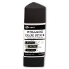
I glued the Halloween words from the Mini Stash to a piece of chipboard using a Collage Glue Stick. 
Cut out the word or words that will fit the space.  I chose Trick or Treat.  The word "or" was not included on the sheet, so I just cut an O and R from other words on the page.
Use the Sanding Grip to sand the edges of each tile.
Then ink the edges with your favorite Distress Ink.
Add foam squares to the back of each tile.
Add the letters tiles to the board along with the Timepiece.  Can you see all the Tarnished Brass splatter in the background?
I added the House to the board but it needed a little something.  I noticed out my window that the roses in my front yard needed to be deadheaded, so I got my clippers and made a few extractions (now to find the time to do the rest!).
Perfect for a little texture in the corner of the house.  Yes, I realize that the dried rose is very delicate and it may only last for this year, but if I pack it right it may last longer.

please click on photo to see the entire project

I had a great time making this project.  Love how the background turned out...just dark enough so the letters stand out, yet still show the Halloween images. 

And those names...love when a surprise piece of vintage ephemera makes new product even better.

Hope you enjoyed today's project and that you will try mixing old with new, to create something fun.

now carry on,
paula

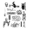
products used in this project