I started with the idea of making little frames from heavy manila cardstock. I cut some rectangles, then used 2 of the Sized Rectangles to cut out the center.
I laid one of the Sized Rectangles on the top half of the cut cardstock, then secured it in place with washi tape so it would remain in place when it runs through the Vagabond machine. I actually cut 3 frames at one time.
Here is what they look like in mass.
Once the frames were cut, I gathered some supplies. The new Pumice Stone Distress Paint, and Archival ink in Monarch Orange and Watering Can (loving this new grey color!) Grey is the new black, right?
Use the Distress Paint on a Blending tool to add paint to the frames.
I thought I would take a shot of two ways to paint the frames. If you want a very light coat then use a circular motion to add the paint (right). If you want great coverage then pounce with the blending tool (left). Both levels of paint have their place in this project.
I used the subway stamp you see here (SA - Remnants) and Watering Can Archival ink on one of the small frames I previously cut and painted with the "circular motion" technique.
By using the lighter colored frame it gave more contrast to the words.
For the other solid grey frames, I used both the Monarch Orange and Watering can to add pattern to the frames. These are the stamps I used, but any stamps that create different scale patterns on the frames will work (you will see the stamped frames in just a bit...right after the stenciling part).
Use the Layering Stencil - Cargo to add letters in random spots across the white cardstock. I know, I went for a total contrast here with Mustard Seed Distress Ink! But it works!
Here is how it looked when I finished.Adhere the stamped frames (there they are!) in a pleasing arrangement over the white cardstock. I slipped a piece of matching white cardstock under the polka dot and text frame to cover the yellow stenciled letters. I also added some printed paper from my stash across the bottom of the layout and under the subway stamped frame.
Now to fill the frames...
I chose a stamp from the "Stuff to Say"set for the center of the polka dot frame. I inked the part of the stamp I wanted, then stamped it on the white cardstock I previously slipped under the polka dot frame.
Slip the white paper back under the frame and close it up with Tissue Tape.
Remember the feather from last weeks post?
I dipped it into Distress Glitter - Antique Linen for a subtle shine (but just on one side).
the. feather. is. perfect.(you know I had to add some Remnant Rubs, right?)
Now for the details -
A little straight stitching...
a little zig-zag.
Industrious Stickers - my favorite arrow points at the main stamped message.
some letters and a word that I love.
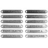
A little trick I leaned from my friend Chelle...I used my Tonic scissors to clip off the metal ends of the word band (please be careful if you try this - put some safety glasses on!).Rub Snow Cap Dabber paint over the word band, then wipe away the excess with your finger tip.

carry on,
paula
products used
click below for more info
click below for more info


What a cool project. Whoda thunk it all started with the feather?!
ReplyDeleteThis is just fabulous!!!
ReplyDeletethis looks great! I love your attention to every detail.
ReplyDeleteand...you are right! grey (aka watering can) IS the new black.
One feather and look at the gorgeous project. I love it.
ReplyDeleteBeautiful! Great tutorial. Thanks.
ReplyDeleteYour project is fantastic as always! The feather is simply fabulous and i want it!!!!!!
ReplyDeleteTHAnks for sharing your ideas with us! BArbarayaya
I love it. What a great project! Thanks for sharing Paula.
ReplyDeleteAwesome!! I love that you made a LO and I'm glad you didn't waste that feather! Now the big question is...what are you going to do with all the leftover frames??? :D
ReplyDeleteThat is just flat out cool. The frames are inspired...and so easy. You made me smile on a very bleak day. Thanks.
ReplyDeleteYou're right, grey is the new black, and new white, and new brown..... we attended a Parade of Homes last weekend and EVERY house was predominantly grey inside and out! I like the colors you chose to coordinate with the grey. Love the multiple frame concept!
ReplyDeleteGREAT page! OMGosh, as I looked at every detail I couldn't smile big enough. Nice work! :)
ReplyDeleteGreat ideas, you always get my brain to whirling.
ReplyDeleteWow!! Love, love love
ReplyDeleteKaz x
This is gorgeous! Love those frames, all the special details, the stamping of course and fabulous colours.
ReplyDeleteThe new black is great...lol! This layout of everything is wonderful!!! Love love love the frames! Oh the stitching too!
ReplyDeleteI think you rock at kooky ideas! Love this layout and it all started with a feather!
ReplyDeleteLove it!!
ReplyDeleteWow! Love it!
ReplyDeleteGorgeous page, super steps, glad I saw the link from Facebook - BJ
ReplyDeleteFantastic!! I love, love, love your creativity!
ReplyDeleteReally love this layout what a great way to use those frames. Love all the stamping and stencilling too x
ReplyDelete